-
Architects: Primer Piso Arquitectos
- Area: 156 m²
- Year: 2022
-
Photographs:Luis Abba
-
Manufacturers: Holcim, Friolatina, Ladrillera Basile, Lumenac


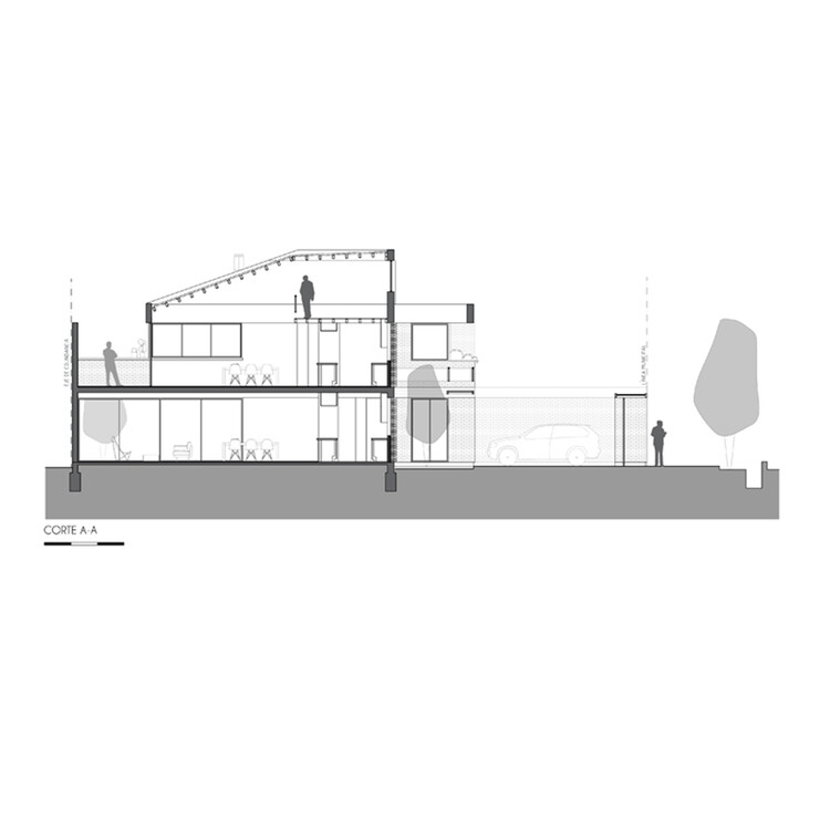
Text description provided by the architects. The Segura 1124 building is located on a 165m2 lot, on a narrow and busy street in Godoy Cruz, Mendoza, in a low-rise residential area undergoing transformation and densification. A municipal particularity of the lot acts as a conditioner of the project, aiming to avoid affecting the block's core in the last two meters towards the rear of the lot.


Hence, the implantation is the result of freeing up a space in front of the lot for the storage of vehicles and the clearing of the rear "patio" to form said block core required by the municipality. The premise was to resolve two functional units with one bedroom + a study or a room that could be used sporadically as a second bedroom. As a result, the construction has two units with a total of 156 m2, a unit of 68 m2 and another of 75 m2 and 13m2 of common spaces.

The program. A new client, a new lot, a new project, but a program similar to Martínez 3458 in terms of multifamily housing. This project gives us the chance to reconsider the elements and their combination, attempting to verify both material and spatial aspects that emerged during the construction process of the previous building and the design of Segura 1124. This building, like Martínez, plays with the same rules: a lot between party walls with identical orientations, particular municipal limitations, and little surface area to develop apartment units that had to be comfortable. The project adopts the requirements that the pandemic has indicated to us as elementary: the relationship with green spaces, the privacy between units, and the incorporation of light and flexible spaces that could perhaps function as home offices or an extra bedroom.


Each unit has its own outdoor expansion. Green spaces were created for both apartments, the lower one has two gardens of its own and the upper one achieves its privacy towards the front with a flower bed next to the bedroom that allows nature to be integrated into daily living in addition to a 60 cm window sill at the back that supports pots while avoiding direct views of the patio below. This unit also has a small patio that completes it.


The relationship with the site. In front of the lot, across the street, there is a linear park with large-scale vegetation and green spaces with high attendance by the community, recreational and sports activities, and two means of sustainable connection, the electric tram metro and one of the longest bicycle lanes in Greater Mendoza. This gives the inhabitants of this site a great quality of life and the possibility of looking for views in this green lung. This is also the reason for which screening is used to give texture and light to each space and in turn generate privacy and security in the front faceade of the apartments. This project allows the possibility of thinking about living in relation to the city. Like the Martínez Building, it is enough to cross the street and join a network of bicycle lanes that connects the entire city. These buildings work on their integration with the urban fabric and what it offers; in this case, the incorporation of the park and its leafy trees into both houses as well as enjoying the public connectivity.


The materiality. A reinforced concrete beam on the facade serves to frame the access, supports the covers that protect the walkway and the stairs from the sun and rain and supports the mezzanine corresponding to the second unit. The set of beams, roofs, walkways, and stairs border a green space that acts as a transition between the outside and the inside, the urban and the private. The raw exposed concrete without additional treatments in combination with the brick used in different ways, results in a stripped-down and simple aesthetic. A staircase and a metal walkway are thought of as attached, subtle and light elements that contrast in texture and expressiveness with the materials that make up the structure. This language, which seeks the expression of each material as such, is a constant in the studio's work, questioning mannerisms and trying to make each element justify itself.


